VEXO /Documentation
Device Distribution
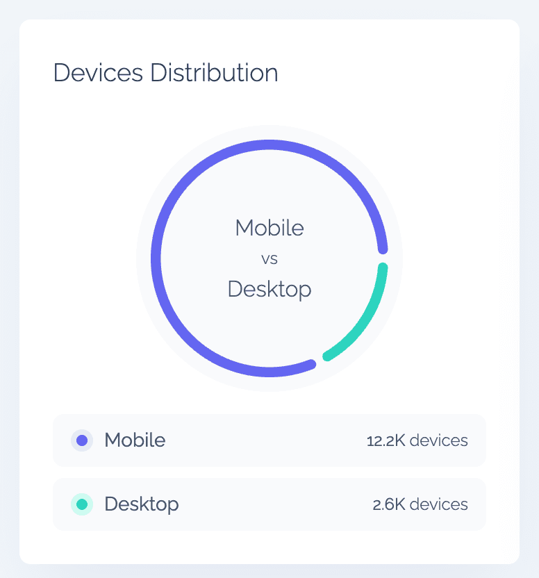
Understanding the distribution of devices your visitors use — whether desktop or mobile — is key to optimizing your website experience. By knowing which device types dominate, you can prioritize design adjustments, performance improvements, and testing accordingly.
For instance, if most of your visitors browse from mobile, you might focus on mobile page speed or responsive layout improvements. Each device type is counted once, regardless of its specific model, providing a clear picture of overall usage across categories.
Previous
Web Usage
Next
OS Distribution